Tobaldini is always in step with the times and has been demonstrating this for the past couple of years through its institutional image (the famous image of the metal bull) and the complete renewal of corporate communication (through impactful tools such as the new corporate website, the institutional brochure and a continuous presence in social media).
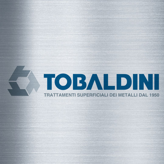
Now, to complete the renewal of its image, comes the new logotype: more current and personal, above all, original and recognizable.
The historic blue color of the previous logo remains, which now features a more current and modern font, flanked by an original symbol that recalls metal (in color) and Tobaldini’s “T” (repeated three times, as if to form a constructive detail).
A change that further testifies to our desire for innovation and to meet the needs of customers who are increasingly attentive to the quality of services and products.

